

Responsive site redesign for a local sushi restaurant rolling out their newest online order feature, Build Your Own Sushi Roll
SUSHI HANABI

ROLE: Research, UX/UI Design, Prototyping, Usability Testing
*This is a student project completed as part of my design portfolio.
To redesign the online order platform for Sushi Hanabi and to include Build Your Own (BYO) Sushi in a responsive website.
THE PROBLEM
The high-level goals and objectives of this project were:
to introduce a Build Your Own Sushi Roll menu as there are no offerings to create your own sushi roll.
to include the Build Your Own Sushi Roll menu in the online order platform with a responsive website.
THE GOAL
EMPATHIZE
The project began with my research goal in mind - to learn what factors are considered in a Build Your Own food or beverage menu. I started first with market research to learn what users are looking for in customized menus followed by a competitive landscape analysis of restaurants that allow consumers to customize or build their own meals.
RESEARCH PLAN
My secondary research consisted of reading various food and beverage articles regarding the benefits and downsides of outlets allowing patrons to build their own menu item. What I found was:
SECONDARY MARKET RESEARCH
For the Competitive Landscape Analysis, I looked at food and beverage vendors who allows customers to create or customize their own orders - Chipotle, Blaze Pizza, and Starbucks.
There were only a couple items that the three vendors all shared in common - the option to add a side to the order, the option to add a (non-alcoholic) beverage to the existing order, and to add a name to each placed order.
COMPETITIVE LANDSCAPE ANALYSIS

click on image to view in larger scale

From the secondary market research and competitive landscape analysis findings, I was able to create our Persona, Simon Hobbes.
I learned from Simon, a millenial, that he enjoys customizing his food orders as it helps him watch his daily caloric intake and gets to try out new ingredients or food items. Simon share with us his restaurant preferences, along with goals and frustrations when placing online orders. Keeping Simon’s goals and frustrations in mind helped me ideate more efficient processes for key features within the app.
PERSONA - MEET SIMON HOBBES
click on image to view in larger scale
DEFINE
The image below is the main Task Flow that I focused on - Checkout Flow as a Guest. This task flow encompasses the BYO process along with the checkout process. I would later use this Task Flow for my Prototype and Usability Test. Even though there’s a lot of Task Flows for this project, I still really enjoyed creating the Flows. It helped me to think about the user and the steps that they would take to create their own Sushi Roll or what they might do during the Checkout process.
TASK FLOWS

click on image to view in larger scale
The scenario I used for the User Flow was:
Simon is getting off from work late again and is starting to get hungry. Simon's in the mood for sushi and wants to order from his neighborhood sushi restaurant and take his order home to eat. Simon goes to the Sushi Hanabi website on his mobile. He sees that they have a new menu item, “Build Your Own Sushi Roll”, and you can either create your own roll or customize from their suggested rolls.
It was important that I made the User Flow be as close as possible to what might happen during an order and checkout process. I had Simon face different decision points during the User Flow which were:
Does Simon want to create his order from scratch or customize from suggested rolls?
Does Simon want to login before placing an order?
Does Simon want to order from a saved item after logging in?
Does Simon want to add another item to the order?
Does Simon want to favorite his order for next time?
USER FLOW

click on image to view in larger scale
IDEATE
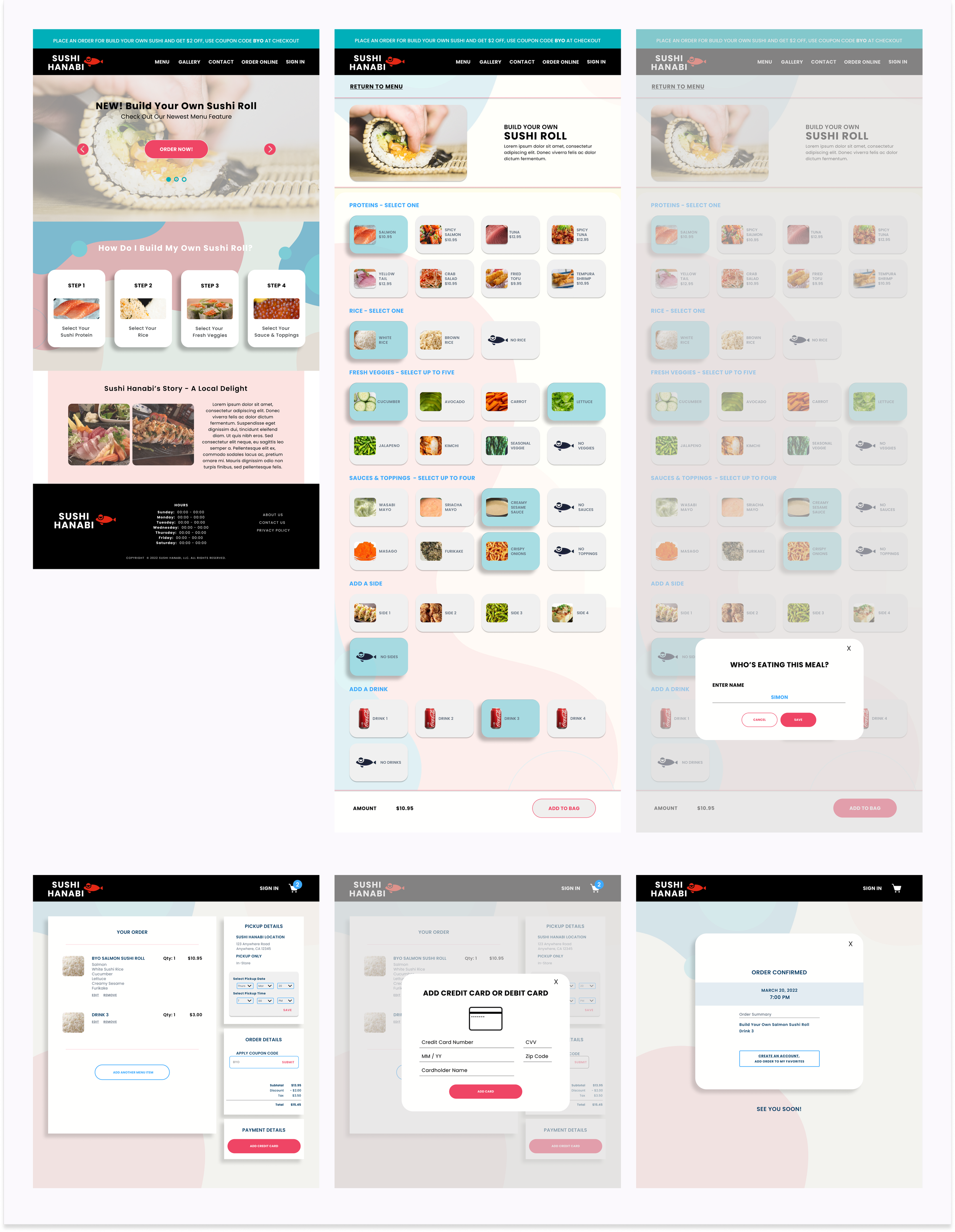
For the Low-Fidelity Wireframes, I focused on creating the Mobile format first. I created the Desktop and Tablet formats after the Usability Tests and are included at the end of this case study under UI Mockup. I wanted to focus on how users would build their own or customize sushi roll, as shown in the user flow, and complete their online order. The following wireframes I created in Mobile format were:
Login
BYO Sushi Roll
Adding a Favorite Item
Ordering a Favorite Item
Order Process
LOW-FIDELITY WIREFRAMES

click on image to view in larger scale

I went with a basic design for the High-Fidelity wireframes to use for the upcoming Prototype and Usability Tests. I thought it was more important to test the flow of BYO Sushi Roll and Checkout process and not have the Usability Test participants get hung up on the design during the tests. I would create the UI mockup after Usability Testing.
HIGH-FIDELITY WIREFRAMES
click on image to view in larger scale
PROTOTYPE
I created four different prototypes in mobile version as I also wanted to use them for the Usability Tests. My main goal for the prototypes was to think of the user and the natural flow of how they might place their own BYO Sushi Roll order. Below are four different prototypes that I created:
Build Your Own (BYO) Sushi Roll & Guest Checkout (see Prototype below)
Sign In & Order Customize Roll
Order from Saved Item
Add Another Item
click on prototype above
TEST
I conducted the Usability Test remotely using Maze and recorded via Zoom. I had five participants, ages ranged from 26 to 74 years old, who were all familiar with ordering food online. All five participants shared their screens while they navigated and completed the given four tests and various tasks.
Test #1: BYO Sushi Roll and Guest Checkout
Test #2: Sign In, Order from Customize Sushi Rolls, and Favorite Order
Test #3: Order from Saved Item
Test #4: Add Another Item
Since we were rolling out a new feature I wanted to make sure that we achieved the following objectives and goals below:
USABILITY TEST

click on image to view in larger scale
Feedback from Usability Test Participants
Below are some of the feedback provided from the different Participants during the Usability Testing:
Test 1 was straightforward, felt very natural and similar to how Tester has built custom orders
it was weird that there was no page to confirm before submitting order
Test 2 was very clear and pretty straightforward like when you normally use an online ordering platform
Liked all the photos with each of the food item in the menu
Tester doesn’t favorite any food items because on the app when they click on the same restaurant then it will tell them their previous order, shows up at the beginning of their ordering process
Tester has never added a menu item to Favorites
Tester thought it was interesting that the drink was not included in the Favorites, even though in previous test it was part of the order that got favorited
Tester mentioned that there was no differentiation between checkout and the add another menu item screen, looks exactly the same
Tasks were natural, good flow
Tester thinks it’s important to see Add More to Order clearly when placing food orders on app so they’re not having to look for it
Add Another Menu Item option was in a much better place than where the Tester normally encounters IRL
Make the menu item label, menu image, and description all applicable to select
Have Add Another Menu Item appear as a sidebar during the order process
Have an indicator to show that there is more down the scroll
Have checkout process an up to two-step process for users who have an account and cc info saved

UI KIT
click on image to view in larger scale
UI DESIGN - DESKTOP
click on image to view in larger scale

UI DESIGN - MOBILE
click on image to view in larger scale
FINAL HIGH-FIDELITY DESIGN
click on Prototype to create your own BYO Sushi Roll
I really enjoyed working on this project as it helped me comprehend the different steps of an e-commerce app design and keep the users in mind during research and design.
Even though the project started off to be a responsive website redesign for Sushi Hanabi, I primarily worked on the mobile format so that I could successfully roll out the BYO Sushi Roll menu feature. I would like to revisit and incorporate some of the feedback I was provided during the Usability Test which included:
Make the menu item label, menu image, and description all applicable to select
Have Add Another Menu Item appear as a sidebar during the order process
Have an indicator to show that there is more down the scroll
Have checkout process an up to two-step process for users who have an account and cc info saved
IN CONCLUSION & NEXT STEPS
After I conducted the Usability Testing, I worked on the UI design of the Sushi Hanabi app and desktop screens. I wanted to update and modernize the look by using bright colors with a background image.
ITERATIONS
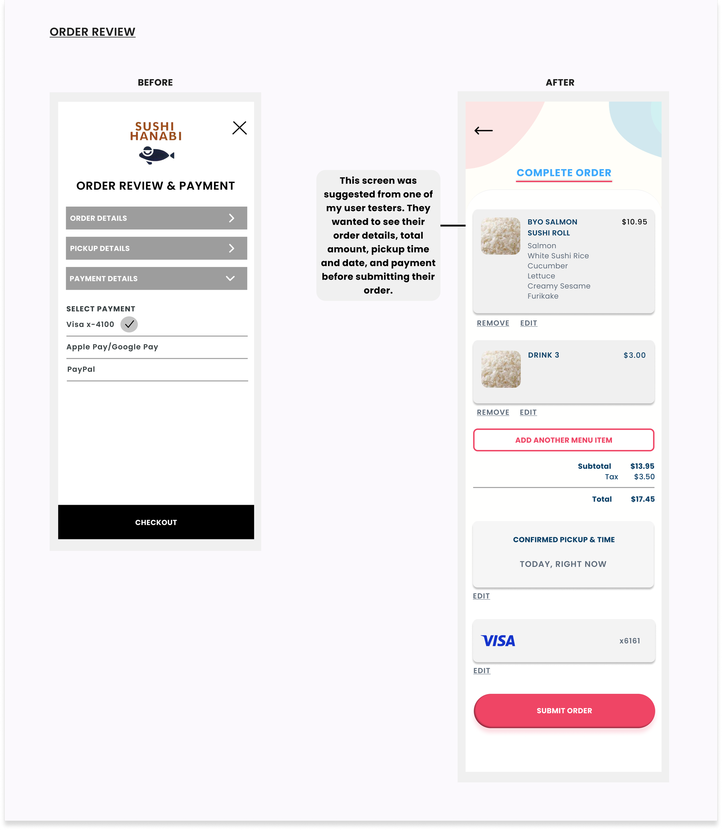
Once I completed the UI Kit, I updated all the screens and revised the visuals of the checkout flow. The following items are the iterations I made:
click on image to view in larger scale

click on image to view in larger scale
one of the feedback I received from the Usability Test was that they wanted to be able to see the entire order details before submitting the order which is reflected on the second set of screens below
instead of making the different stages of checkout as a drop down like I had in the earlier set of high-fidelity screens, I made them into individual pages

updated the UI for the ingredient selections and choice

Test Objectives and Goals
To test how easy it was to locate the Build Your Own or Customize from Suggested Rolls
To test how easy it was for Testers to place a Build Your Own Sushi Roll order, review order details, schedule a pickup time, checkout as a guest, and go to sign up to create a new account and redeem points
To test Adding a Favorite and Add Another Menu Item features
To clearly define and identify user’s frustration and pain points while placing an order through the mobile website
To evaluate the overall ease of the prototype and order and checkout process
Test Results
Below is a screenshot from Usability Test #1 (BYO & Guest Checkout), Task #2 (BYO Sushi Roll), Screen 3 (Select Rice) with heatmap. I selected this screenshot as it had one of the highest misclick percentage and usability score. This particular task was to have participants select White Rice as their choice of Rice and then click Next.
Even with the limited choices available, this particular screen had the highest misclick rate of 67% (as several participants didn’t click on the selection before clicking Next) and the lowest Usability score of 66.
click on image to view in larger scale
click on image to view in larger scale